


konfab
Honorary Master
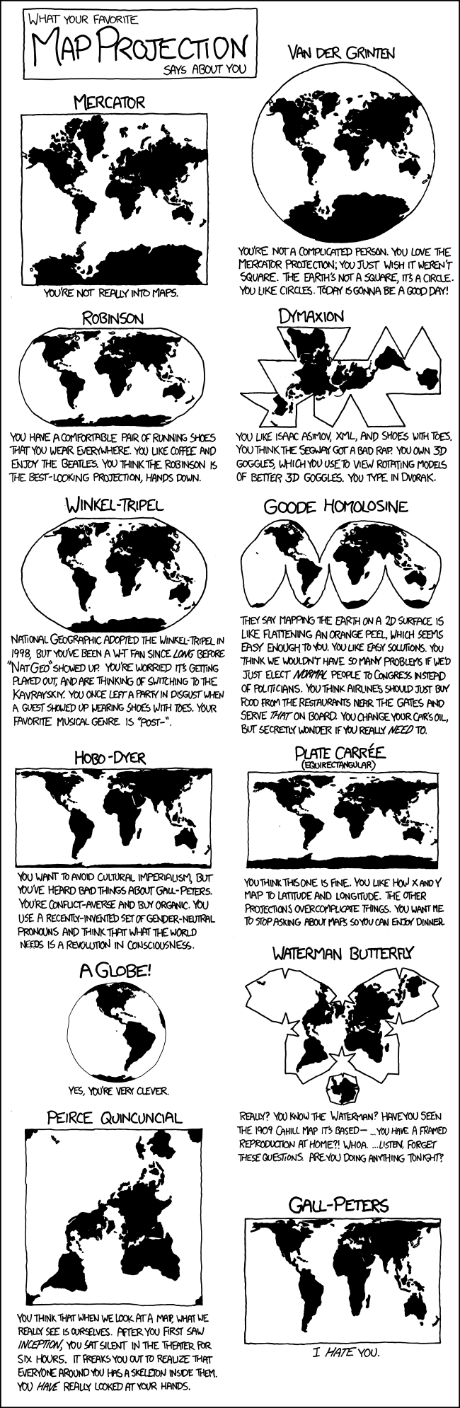
And because XKCD is always relevant:
South Africa’s biggest forum. Discuss, discover, and connect with thousands of members.
I have. Flying to Europe is 95% flying over Africa.Have you ever travelled?

Ah, so almost South - North navigation. Have you travelled to Australia or the US?I have. Flying to Europe is 95% flying over Africa.


I am not really good at this but it seems similar to the one on BBC.That's not a real Equal Area map, it's fake...


 www.bbc.com
But critics of the Mercator map say there is a psychological effect to viewing some places as smaller than they actually are and others as larger, as we instinctively view bigger things as more important.
For Kenyan geographer Kioko Muendo, this has implicitly downplayed Africa's vast resources, population and investment opportunities.
"Maps are more than just guides for travellers - they shape how regions are perceived politically and economically," he told the BBC.
I am not really good at this but it seems similar to the one on BBC.
View attachment 1935498 View attachment 1935500
What different world maps get right - and what they get wrong
As the UN adopts a new world map to reflect Africa's true size, let's take a closer look at what different maps get right and wrong.


They need to draw cape town smaller so people can finally realise it is full.


Texas is so big, you can fit Africa, Europe, America and Texas inside it.

True storyTexas is so big, you can fit Africa, Europe, America and Texas inside it.
With all them gays there a Vaalie like me just has to lay off the smokes and do a once-in-a-blue-moon prostate check and I might get an open spot before Vaaldamhalla takes me?
View attachment 1935655

Tbh, I'd say neither. It's best for the layman to understand the basics, that it represents a globe.There's a simpler summary - new map is best for laymen geographically speaking, and we are mostly laymen here.

Tbh, I'd say neither. It's best for the layman to understand the basics, that it represents a globe.
In the first three years of schooling, geography started of with a tilted globe on a wooden stand that was on the teacher's desk when discussing it, or on a shelf in the back of the class off to the left when not. It even had some raised areas for mountains,
This globe was used to discuss thing like seasons, eclipses etc.
Also part of the learning process where two maps, one like a cut sphere flattened out - probably a Dinomic (interrupted) - and a stock Mercator map. These two maps hung at the back of the class above the shelf with the globe when not in use.
The funny cut map was explained, referenced back to the globe. One arts & crafts class was an A4 colouring page with the
photocopied funny interrupted earth map that had to be cut out, stuck together, to form a ball, then painted to make a globe - the earth.
In the first few years of schooling you intuitively understood why any map of the earth on a flat surface would only be a representation, not accurate. This is what the layman should understand, rather than siding with one flat earth map or another*.
* This is why people donner off the edge of the earth.
Sure, but the problem starts with people using a map, not understanding what it represents. A bit like trying to learn maths parrot fashion. Thus my chirp:No disagreement, but we're discussing maps here.
And, although I had a globe for most of my teen years, never seen the need to get another one.
* This is why people donner off the edge of the earth.


