Burger King's new logo

gregmcc

Honorary Master
Joined
Jun 29, 2006
Messages
29,794
Reaction score
11,046
Location
Somewhere in the world

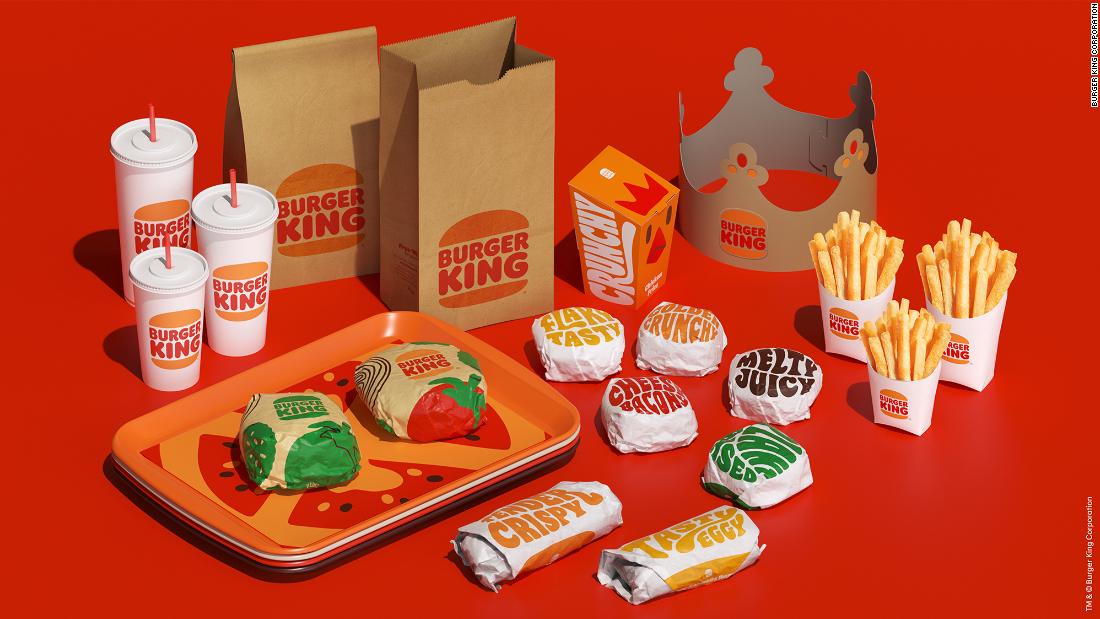
Using colors inspired by its "real and delicious food," the fast food chain unveiled Thursday a retro-influenced new identity that includes a redesigned (yet recognizable) logo and new food packaging, employee uniforms and signage in its soon-to-be remodeled restaurants.
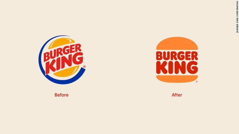
Burger King's old and new logo.


Burger King's old and new logo.
The centerpiece of the redesign is the logo, ditching the blue curve that's been in use since 1999. Burger King said in a press release that the new "minimalist logo seamlessly meets the brand evolution of the times." It also pays tribute to brand's 64-year-old history, with the refreshed look emulating an old logo used from 1969 to 1999.
Customers will notice colors that are "rich and bold" on its signage with a new, custom-made font called "Flame." The chain said the font is inspired by the shapes of its food because it's "rounded, bold and yummy."
 
I like it

and the '80s.
 
Everything is trending toward simple & flat so no surprise there. Looks fine to me. Some of the uniform graphics are also quite cool...

(on the right)
210105120345-02-burger-king-rebranding-exlarge-169.jpg
 
As I pointed out in the Kia logo thread, it is very trendy today to go either space-age or retro age and retro is coming back strong. I am an avid marketer and I do study trends, but it amazes me how many 'strongly' suggested against retro, but are all now pushing this style. Just like punk has picked up over the past 5-6 years which is a retro style. Even I opted retro 2 years ago with branding.

Though I like it, it is becoming much more common than it was in its own age.
 
Why'd they get rid of the blue? Is Burger King a Republican?
The blue is too clinical and sterile a colour...kinda wierd on a burger. I don't want to think their burgers taste like sanitizer.
 
Everything is trending toward simple & flat so no surprise there. Looks fine to me. Some of the uniform graphics are also quite cool...

(on the right)
View attachment 989268

Flat become a staple in 2013 in online marketing, and the established corps only started to assimilate it into their own branding in 2018. At this time abstract is coming into the online space and I won't be surprised to see it trend. As many said that parallax is dull and have no place, it is now in most new designs.
 
Some ad agency probably raked in millions for that design...
 
Top
Sign up to the MyBroadband newsletter
X