Amazon changes app logo that 'resembles Adolf Hitler'
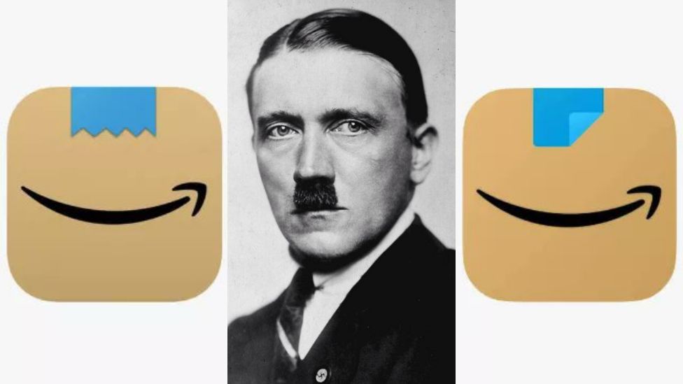
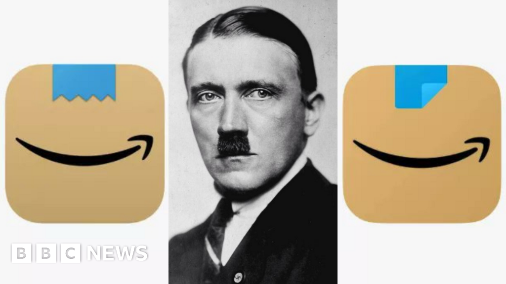
The new design shows a folded corner of blue tape on an Amazon box.
 www.bbc.com
Amazon has quickly changed its main shopping-app logo, after commentators said the recent redesign made it look like Adolf Hitler.
Launched in January, the icon depicts a strip of blue tape over an Amazon "smile" logo.
But some observers said it resembled a toothbrush moustache, associated with the Nazi dictator.
The technology giant has now changed the design to a folded blue tape, following customer feedback.
Amazon told BBC News the first icon had been trialled in a few countries before the change had been made.
Branding agency Coley Porter Bell chief executive Vicky Bullen said: “Unfortunately for Amazon, the visualisation of their parcel tape on the original logo will immediately be associated as a Hitleresque moustache, as that shape is forever embedded in our [subconscious] brains as such - not the best association for a brand that wants to create delight on the doorstep.”
The app logo - which appears on smartphones and tablets - previously showed a graphic of a shopping trolley.
The new design appears to be based on a brown Amazon parcel, with the company's signature smile and blue tape.