


cerebus
Honorary Master
No but it's stopped being a conversation about the Apple Watch in any useful senseIs this where you blame me? Should I leave?
South Africa’s biggest forum. Discuss, discover, and connect with thousands of members.
No but it's stopped being a conversation about the Apple Watch in any useful senseIs this where you blame me? Should I leave?

Is it my fault that its not interesting enough to keep us interested?No but it's stopped being a conversation about the Apple Watch in any useful sense
If you weren't interested you'd have left the thread.Is it my fault that its not interesting enough to keep us interested?


As already mentioned you just flip the watch and reverse the strap so the crown is on the left. Apparently there is a left handed modeApple Watch: Are Lefties Being Left Out?
The madness has begun. On Tuesday, Apple unveiled the Apple Watch, its first new product since the iPad was released in 2010.
Don’t be fooled, this watch does more than just tell time. Users can check their email, send a text message, look at their photos, and even track their fitness routines. There’s just one problem: the newest cutting-edge piece of Apple technology leaves lefties out.
There is no model of the Apple Watch that accommodates lefties. Much of the watch’s operation relies on a ‘crown’ (basically a dial) located on the right side of the face. This crown enables the user to zoom, scroll, draw in or tap out of contact lists and conversations. If you are a lefty, wearing the watch on your right wrist, you have to reach across the face and twist your wrist awkwardly to manipulate the crown. This renders a big part of the watch’s functionality difficult for most lefties to access unless they just take it off their wrists altogether and set it on a flat surface. In that case, they may as well just use their phones.
More here : http://www.boston.com/business/tech...ng-left-out/CGlWZHjqeIEAkvAAUoX0nJ/story.html

If you weren't interested you'd have left the thread.
Someone is butthurt :-/
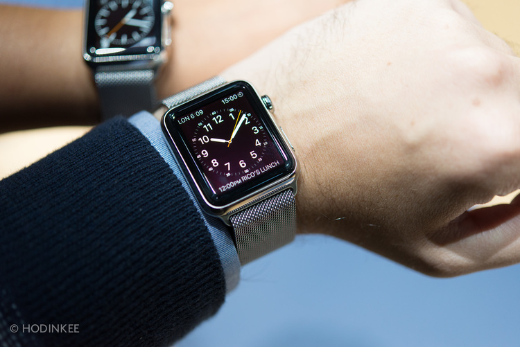
The overall level of design in the Apple Watch simply blows away anything – digital or analog – in the watch space at $350. There is nothing that comes close to the fluidity, attention to detail, or simple build quality found on the Apple Watch in this price bracket. The Sistem51, for example, is a very cool, inexpensive mechanical watch. But it feels like it costs $150 (for the record, I bought one and adore it). Then, for closer to the price of the Apple Watch, you could own this, which is, well, downright horrific in just about every conceivable metric. Seiko does offer some nice things at $349 or less, but again, they feel like they cost exactly what they do. The Apple Watch feels like a lot of thought went into it, and no doubt it did. It feels expensive.
Overall design of the object – most obviously, the way that curved screen flows perfectly into the case – is just gorgeous. As Tim Cook said during the keynote address, you can barely tell where the software stops and the hardware begins. The rounded edges are very Apple, even very Marc Newson, who, based on absolutely nothing but a gut feeling, I'm sure had something to do with the design of the Apple Watch. Why? Just look at it. Also, take a read of this article I wrote back in 2012 when Newson's Ikepod showed its then new Horizon. I call attention to the fact that the bezel is seamlessly integrated into the case. Not dissimilar to the way the screen of the Apple Watch wraps into the body. And the strap found on the Apple Watch Sport? Look at the strap from the Newson-designed Ikepod. Jony Ive's friendship with Newson is well documented and it's possible they simply shared ideas over drinks, or maybe Newson was entrenched in the project, imparting all he learned at Ikepod with his friends at Apple prior to the announcement he'd join their ranks. We will never know.
If I had to criticize the actual form of the Apple Watch, it would be a complaint you've heard from me before (most recently with the Habring2 in our latest Three on Three); the Apple Watch doesn't fit under my shirt cuff without serious effort, if at all. I believe that great design should not disrupt daily life, and a watch that doesn't fit under a shirt sleeve is missing something. Apple is amazing and building thin, elegant machines, and I was surprised by how bulky this is, especially when the 45 minutes prior to the introduction of the Apple Watch were spent discussing how svelte the new iPhone 6 is. I understand the physical limitations and the required dock on the rear of the watch, but the Apple Watch is bulkier than I would've liked.
And about that. The Apple Watch is an incredible piece of engineering, no doubt. It is still not as cool as a mechanical watch, to real people. This might change with time, but my feeling is that not any time soon will a digital wristwatch, no matter what it's capable of, be considered "cool." I am talking pure aesthetics, and 100 perfect superficial judgement here, but at the end of the day, I don't see people that love beautiful things wearing this with any great regularity.
Interesting? Overwhelmingly biased if you ask me…
I had a few problems with that article.I do think that Apple has gone overboard with some of the UI stuff which in some cases just leads to a convoluted mess but I can't fault the launcher as it appears the device is app centric.
"How are you supposed to tap that tiny star?" Lol... You hard/long press the screen and a contextual menu appears.
The Wear's ui has been heavily criticised in the reviews of the Moto 360 that are coming out over the last couple of days. I really don't know but I suspect one would need to play with them together and see how effectively they work in reality before making any conclusions.
MKBHD
[video=youtube;nxM-rac7vb4]https://www.youtube.com/watch?v=nxM-rac7vb4&list=UUBJycsmduvYEL83R_U4JriQ[/video]


Apple announces new iPhones, Apple Watch
Apple
It's that time of the year again: Apple announced a bunch of new products. First, the iPhone 6 and iPhone Plus - 4.7" and 5.5", with upgraded silicon, better camera, and a new design. They both look like fantastic and worthy upgrades for iOS users, although I'm sure some are going to cringe over the camera bulge and the hilarious, Samsung-y one-handed mode called Reachability (yes. That is a thing. A thing Tim Cook showed off as a feature).
Moving on, the biggest news, of course, is Apple's entry into the smartwatch market. It's called the Apple Watch, and to sum it up: they put an iPhone on your wrist - including a homescreen, endless applications, a long list of features like using it to control other Apple devices, and so on. The user interface is operated through a combination of a crown on the side of the device and the touchscreen. The touch screen can sense the difference between a tap and a press, with the latter being used a right-click sort of thing.
If this sounds complex for a watch, you're not alone. The interface looked incredibly cumbersome and complex to me - far more so than what I've seen of Android Wear. For instance, the homescreen is a grid of round, zoomed-out icons that you navigate by panning with touch, but zooming in with the crown on the side. In other words, you have to shift from screen to crown to screen to launch an application. Add in the various up/down/right/left swipes, touch+holds, and the difference between taps and presses, as well as the tiny display, and it just sounds cumbersome and complex to me. Take a look at the photos application - now zoom with the crown, pan with swipes, zoom with the crown, pan with the screen, until you find the photo you want (and remember: you have to do it all that with just one hand!). Good luck, with that.
As for the hardware - it's square, and that will most likely be the most dividing aspect of it all. Some prefer square watches, some round. I'm firmly in the round camp, and combined with the 'bulgy' and curvy design of the Apple Watch it just looks entirely unappealing to me - not to mention uncomfortable, with that huge sensor bulge pressing into your wrist. It looks and operates like a tiny computer strapped to your wrist - and that's exactly not what I would want in a smartwatch.
Then there's the weirdest thing about the Apple Watch: that awkwardly huge button underneath the crown. Press it, and it will open a messaging application, allowing you to send messages and make calls to a select group of friends (after scrolling with the crown, of course). Yes, they dedicated the only button on the device to that. It's indicative of something I'm not used to seeing from Apple: everything and the kitchen sink.
In a nutshell - it seems like the Android Wear team is a lot better at saying 'no' than the Apple Watch Team.
The Apple Watch will go on sale "early 2015", will come in two sizes, and six different materials. Straps are interchangeable. Apple only announced the price of the cheapest model (no sapphire on this one): $349. Missing from the entire presentation? Battery life. Apple made zero mentions or references to battery life, which tells you all you need to know. In current versions, it sucks. The biggest drawback? It requires an iPhone 5 or higher. Other platforms are not supported.
It's very hard to make any predictions about where this is going. Will users prefer the everything-and-the-kitchen-sink, complex approach from Apple, or the simpler, restricted approach from Google? This is a new device category, so I have absolutely no idea. This thing is either going to be Tim Cook's iPhone, or Tim Cook's Newton (Peter Bright had the same idea).
I'm not placing any bets.
