
Microsoft logo through the years

Microsoft recently unveiled its latest logo, marking a new era for the company as it heads towards the release of Windows 8 and Office 2013 later this year.
Throughout its 37-year history, the tech company has undergone numerous changes to its logo. As trends and images changed, so did the image and branding of the company.
Let’s have a look at the evolution of Microsoft’s logo, from humble, yet stylish, beginnings.
1975
Microsoft’s first logo was first seen when the company was founded in 1975.
The logo itself is reminiscent of the fonts and style of 70’s branding.
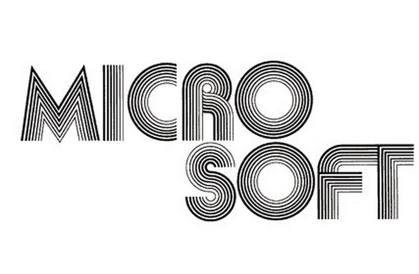
Microsoft logo (1975)
1980
Microsoft’s logo changed fairly dramatically, revealing more edges and sharp lines.
The logo isn’t far from what 80’s metal bands were trying to achieve with their own logos.
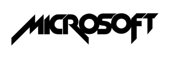
Microsoft logo (1980)
1982
The Metallica-esque logo didn’t last very long, and two years later Microsoft opted for a more conservative image.
The logo represented a new period for the company, establishing the dominance of MS-DOS, which released a year later on the IBM PC.

Microsoft logo (1982)
1987
Five years later, Microsoft re-branded itself with a new logo.
The leaning “Pac-Man” logo (due to the break in the first “o”) was a new look following the company going public with its stocks a year earlier.
Microsoft would go on to stick with this logo for the next 25 years.

Microsoft logo (1987)
August 2012
Microsoft’s new logo is the first in the company’s history to feature colour.
The green, orange, blue and yellow colours have been synonymous with Microsoft’s Windows products, and the company has decided to include them in the logo.
According to Microsoft, the logo “should evolve to visually accentuate this new beginning”, as the company prepares for the launch of its new products.
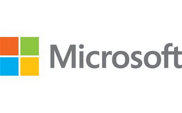
Microsoft logo (August 2012)
Related Articles
What to expect from Windows Phone 8
Nokia Lumia 900 launched on Vodacom: Pricing
Microsoft unveils new company logo
Great gadgets to look forward to


 Loading ...