sand_man
Honorary Master
Hmm, never trust an iPhone user, guy at work swore that new iOS releases always supported all devices...
http://www.jailbreakios7.com/2013/06/ios-7-supported-devices.html#.UbY9T7EaySM
South Africa’s biggest forum. Discuss, discover, and connect with thousands of members.
Hmm, never trust an iPhone user, guy at work swore that new iOS releases always supported all devices...
New look? I don't think so.
How on God's green earth can Apple tout this as an "all-new & completely redesigned UI", when it's so obvious they just copied MIUI??
Shameless.
Was wondering why it looked so familiar.... thanx for the reminder.
Hmmmm astute observation


If I was MIUI, I would take Apple to court & sue the crap out of them.


They get a lot of sales because its a good phone but a fair share of their sales come from the marketing BS(if you watched the release vid) which sounds like some new-age cultish brainwash speech, which sheeple eat up like honey - "OMG, I've never seen this feature on the planet earth ever before"
It's actually not that minimalist. If you look at it, it's highly designed, just not so heavily, woefully overtextured as it was previously. There aren't these vast tracts of white space or unoccupied room that WP/Android have. It uses some quite deep layers of texture that play over each other beautifully - the frosted glass effect is the clearest example of that; but it's built into all the animations, the way they move over each other like they're inhabiting a common space and retain definite considered physical properties.

Then they focused on colour, which comes across in an outstanding, classy way. The palette is vibrant and living; and icons are much more recognizable as a result. It all seems quite mature and thoughtful to me.


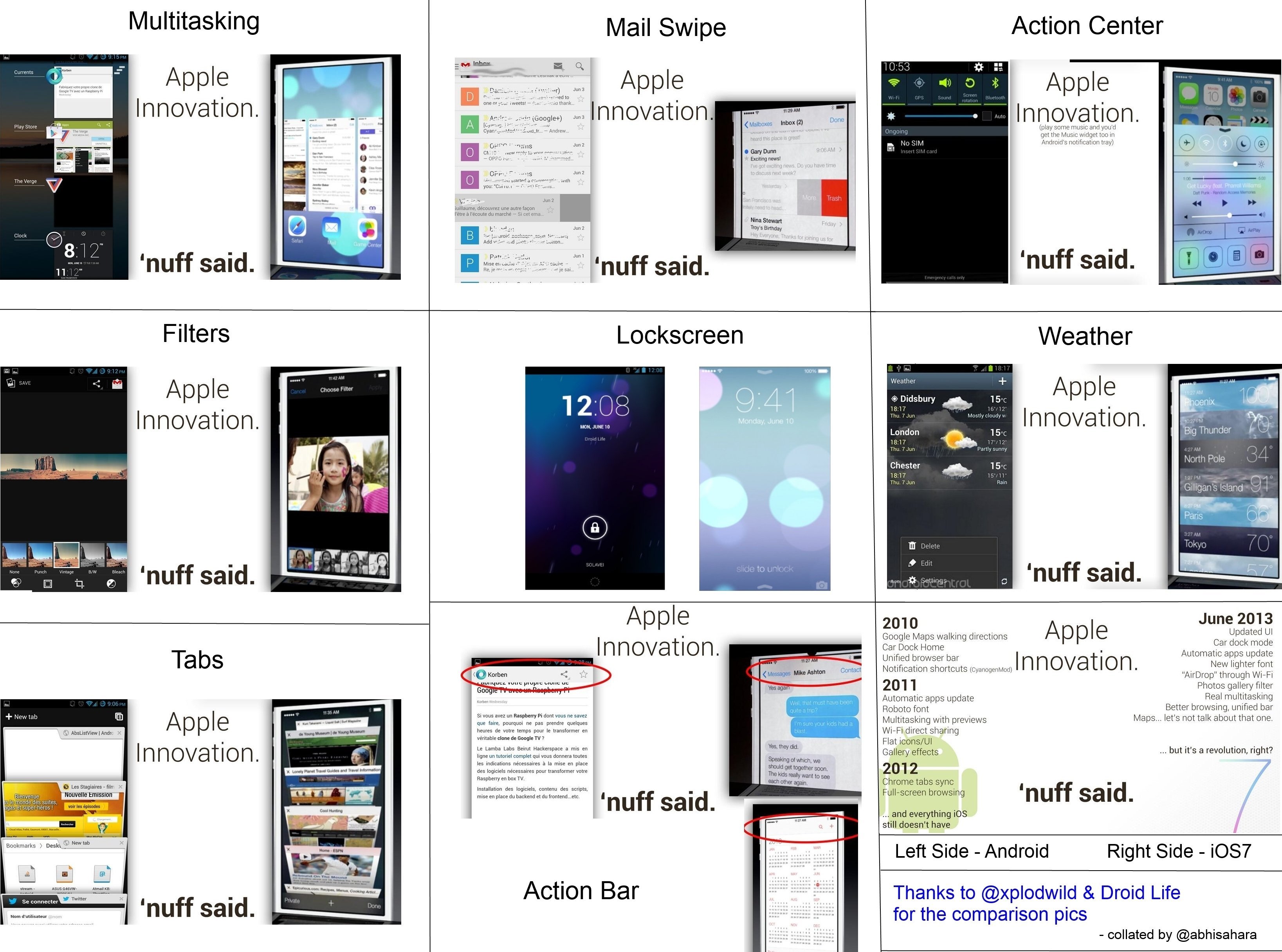
You guys are just jealous. Just look at these new and innovative features.
http://www.droid-life.com/2013/06/10/ios7-vs-android-a-quick-comparison-after-the-wwdc-keynote/
Also, it was the last software update Steve Jobs worked on® so it will be awesome.